MASTER MIX-AND-MATCHING PRINTS, PATTERNS AND COLOUR FOR SUMMER
Faced with the task of getting dressed each day, it can be easy to fall into the habit of playing it safe. But summer is the perfect time to push your style boundaries and explore colour, patterns and prints. With a surge of inspiring new arrivals waiting to be discovered, your new favourite outfits are within reach.
Adding eye-catching pieces into your wardrobe is easier than you think. From classic stripes to on-trend florals and geometric-inspired designs, there are plenty of ways to play with patterns. Boost your 9-to-5 outfits or create show stopping party looks with these simple steps.
DISCOVER THE POWER OF PRINTS AND PATTERNS
The new season is about finding outfits that make you fall in love with fashion all over again. And mixing prints and patterns is a surefire way to reignite your passion for getting dressed.
Think bright stripes, checkerboard pieces, animal prints, polka-dots, paisley and floral motifs, and graphic designs. Whether you dare to clash colours and patterns or prefer to introduce one piece at a time, there’s no need to be scared of straying from more minimalist styles.
An easy entry point to the world of pattern play is to add striped shirts and printed blouses into your rotation. Paired with classic denim or structured tailoring, a statement top will take on a timeless quality in an instant.
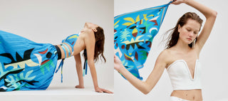
When you’re ready to take things up a notch, try a matching set in an arresting pattern. We simply adore the Curtain Of The Moon Bralette worn with the Curtain Of The Moon Skirt for a truly artful ensemble.
GET TO KNOW YOUR COLOURS
Whether your clothes are plain or patterned, understanding colour theory is the secret to always looking put together. At the core of colour theory is the idea that certain colours create harmony when mixed thoughtfully.
If you look at a colour wheel, you’ll start to notice that colours which are side by side or opposite (often called complementary colours) each other spark a certain joy for the eye. Opposing colours create maximum contrast, which offers a high impact combination. Think blue and orange, red and green or yellow and purple.
Another way to think about colours is grouped by seasons. Knowing your colour ‘season’ will help you determine the best shades to shop for your hair, eye and skin tone.
SPRING
Described as warm and light, spring colours are bright, fresh and full of vibrancy. Just imagine new growth, sprouting bulbs and even the produce that fills market stalls from September onwards.
SUMMER
Cool and soft, a summer palette is the embodiment of a sun-dappled afternoon. Dusty hues and pastel pops will be the best choices – stay away from too much saturation and neon brights – if you have neutral undertones and blonde or ashy hair.
AUTUMN
Autumn colours are easy to imagine. Warm and deep, this palette looks like falling leaves and crisp air. Rich pigments, especially browns and rusts, are the key to balancing your characteristics.
WINTER
Cool and deep, winter light is a better indicator than temperature when it comes to understanding this season’s colours. Jewel tones, icy hues and intense pigments create the best palette for those who have cool skin undertones and darker hair.
LEARN WHAT TO WEAR FOR EVERY OCCASION
When building outfits, it's important to think about where and when you will be wearing these pieces. This will help you determine what will and won’t work for each event in your calendar.
AFTER-WORK EVENTS
The key to mastering 5-to-9 style is learning how to amp up your office wardrobe, simply adding small tweaks to bring your 9-to-5 fits into the evening. This is where the power top comes into play. Match a statement blouse with tailored pants or a sleek midi skirt as the base of your outfit, using impactful accessories to transition the look beyond your desk. Think a punchy pair of heels or glimmering golden jewellery.
WEDDINGS
The number one rule of wedding guest dressing is to avoid wearing white at all costs. You also don’t want to be seen to outshine the bride. Take these points into consideration and go for more classic prints and patterns. Elegant florals are an obvious choice for spring and summer weddings
NYE AND DAYS WORTH CELEBRATING
Now is the time to let your most decadent style self shine. Pull out all the stops with bold, bright and brilliant pieces. High-octane hues, sparkling details, graphic prints and intriguing textures will be sure to set you apart from the crowd.
PICNICS AND GARDEN PARTIES
Classic checks, fun florals and pastel colours make the perfect match for days spent outdoors. Whether you’re having a beachside picnic or a long lunch in the garden, lean into the mood of the season and choose your outfit accordingly. Rich green hues and pops of pink are are great way to dress in line with the theme of late spring and early summer days.
WEEKENDS ON-THE-GO
From mornings at the market to Sunday brunch with friends, weekends are the perfect time to road test some of your more outgoing ensembles. If your plans are a little bit more lowkey, neutral colours, classic prints and easygoing accessories will help you nail the laid-back feeling of days spent relaxing after a busy week.
Learning how to have fun with prints and patterns is the best way to build confidence in your wardrobe. If you’re nervous, start slow. Introduce a bright top or statement pants to build your outfit around to begin with. It won’t be long before you’re donning dramatic dresses in bold colours and accessories that promise to level up your look.
There is always inspiration to be found in the new season. Discover MANNING CARTELL’S latest arrivals and set your wardrobe up for a summer of successful dressing.